Frontend stuff
Drupalcamp Frankfurt, April 2017, session by Nicolai Schwarz

Drupalcamp Frankfurt, April 2017
Just click on the first slide and use the arrow keys. Hit ESC for this overview.
Drupalcamp Frankfurt, April 2017, session by Nicolai Schwarz
The examples are built into the slides. Best use Firefox to try them out, as Firefox supports almost all of the demonstrated features (with the sole exception of CSS Shapes).
Sorry folks, no Drupal here. This session will focus on HTML and CSS. Stuff you are probably not using right now. Some stuff you may have heard about, other stuff will likely be new to you. I hope.
On the other hand, if you are familiar with <menu> and <menuitem>, position: sticky, @supports, scroll-snap-type, flex-wrap and grid-template-areas this session is not for you.
If you are wondering: this presentation uses Shower, by Vadim Makeev.

Nicolai Schwarz, @textformer
Freelancer from Dortmund
#drupal #design #webdevelopment
#editor #writer #lecturer
#gadgets #comics #games #music
Kneel before Zod!
Illustration by Cami Cuibus
HTML has come a long way. Between 1999 and 2014 there were a lot of discussions, but not many new specifications. The idea is to be faster with HTML5, so HTML 5.2 can be expected by the end of 2017.
This chapter highlights the interesting stuff that came with HTML 5.1.
<header><nav> … </nav></header><main><article> … <article><aside> … <aside></main><footer> … <footer>
Sure, it only makes sense next to elements like <header> and <footer>.
If you need to address older IEs that don’t know the <main>-element use
<script>document.createElement('main');</script> or html5shiv.
<details><summary> item 1 </summary><p>More info about item 1.</p></details><details><summary>item 2</summary><p>More info about item 2.</p></details>
More info about item 1.
More info about item 2.
Click on the items!
You don’t need JavaScript or CSS (with checkbox or :target) for toggle effects.
You can use the selector details[open] for some styling.
You can’t style the arrow.
Except in Webkit-Browsers with summary::-webkit-details-marker.
Click on the items!
Well, that depends. You can realize this accordeon effect purely in HTML now, that’s nice. Older browsers that don’t know the new elements will simply display the whole text – without the option to toggle anything. If that is ok for you and you don’t need to style the arrow go ahead and use <details> and <summary>.
<p contextmenu="popup-menu">Right click here … </p><menu type="context" id="popup-menu"><menuitem type="checkbox" checked="checked">Checkbox</menuitem><menuitem type="command" label="Command" onclick="alert('It works!')">Checkbox</menuitem><menuitem type="radio" name="g1" checked="checked">Radio button 1</menuitem><menuitem type="radio" name="g1">Radio button 2</menuitem><menuitem type="checkbox" disabled>Disabled menu item</menuitem></menu>
Right click here to see if the context menu is working in your browser. As of April 2017 this should solely be the case in Firefox.
If you see text under this red box this isn’t working right.
No! See last slide.
(Check again in a few months.)
<img src="images/example-low.jpg"srcset="images/example-low.jpg 1x,images/example-high.jpg 2x,images/example-ultra-high.jpg 3x">
The srcset attribute accepts a comma-separated list of image URLs each with its own x modifier, which describes the pixel ratio (amount of physical pixels in a CSS pixel) most appropriate for each image.
<img src="images/example-low.jpg"srcset="images/example-low.jpg 600w,images/example-high.jpg 1200w,images/example-ultra-high.jpg 1800w">
In this case, the low-res image is defined to be 600px wide, high-res to be 1000px and ultra-high-res to be 1400px.
The user agent can choose any of the given resources depending on the user’s screen’s pixel density, zoom level, and possibly other factors such as the user’s network conditions.
For backwards compatibility with older user agents that don’t yet understand the srcset attribute, one of the URLs is specified in the img element’s src attribute.
<img src="images/example-low.jpg"sizes="(max-width: 40em) 100vw, 50vw"srcset="images/example-low.jpg 600w,images/example-high.jpg 1200w,images/example-ultra-high.jpg 1800w">
In this case, the sizes attribute defines the width of the image as 50% of the width of the viewport when the width of the viewport is greater than 40em, or 100% of the width when its lower or equal to 40em.
<picture><source media="(max-width: 20em)"srcset="images/image1/low-res.jpg 1x, …"><source media="(max-width: 40em)"srcset="images/image2/low-res.jpg 1x, …"><img src="images/default/low-res.jpg"></picture>
The HTML <picture> element is a container used to specify multiple <source> elements for a specific <img> contained in it. The browser will choose the most suitable source according to the current layout of the page (the constraints of the box the image will appear in) and the device it will be displayed on (e.g. a normal or hiDPI device.)
Image selection can get really complicated based on how many conditions you have set and how the browser is supposed to pick the right one (art direction, pixel density, viewport, zoom level, other factors like bandwidth).
My opinion: This is a frickin’ stupid way too complicated mess!
Sure, go nuts! All those new options have a fallback integrated – the well known simple <img>-element. So read up on all the options and use what is best suited for the project.
<a href="drupal_frankfurt_last_version_final_2_approved.pdf"download="dcffm17_sessionplan.pdf">
Download this file.
In this case the link points to drupal_frankfurt_last_version_final_2_approved.pdf, but if you try to download it the filename will appear as dcffm17_sessionplan.pdf.
If you have a field for a specified file, say the menu for a restaurant, and you know that your client will upload the file with stupid filenames you can use the download attribute to enforce a useful filename like restaurantname_menu.pdf.
<form><label for="firstname">First name:</label><input required id="firstname" type="text" />;<label for="lastname">Last name:</label><input id="lastname" type="text" /></form>
:required { border: 1px solid #F00; }:optional { border: 1px solid #0F0; }
For accessibility reasons the color can’t be the only indicator of a required field!
<form><input id="checkbox1" type="checkbox" /><label for="checkbox1">Check box label here</label><input id="checkbox2" type="checkbox"/><label for="checkbox2">Check box label here</label><input id="checkbox3" type="checkbox" /><label for="checkbox3">Check box label here</label></form>
input:checked + label { background: yellow; }
Click on the checkboxes!
<a href="test.pdf">pdf for download</a>
[href$=".pdf"]::before {content: url("images/icon-png.png" " ");}
It is sometimes quite astounding how many selectors are out there that you don’t use or have forgotten about. They can be quite useful to add usability / achieve effects without JavaScript or adding PHP to templates.
hyphens: nonehyphens: manualhyphens: auto
You need to specify the language with e.g. lang="de".
As before: Using the "soft" hyphen ­ gives you much more control.
Dies ist ein Typoblindtext. An ihm kann man sehen, ob alle Buchstaben da sind und wie sie aussehen. Manchmal benutzt man Worte wie Hamburgefonts, Rafgenduks oder Handgloves, um Schriften zu testen. Manchmal Sätze, die alle Buchstaben des Alphabets enthalten - man nennt diese Sätze »Pangrams«. Sehr bekannt ist dieser: The quick brown fox jumps over the lazy old dog. Oft werden in Typoblindtexte auch fremdsprachige Satzteile eingebaut (AVAIL® and Wefox™ are testing aussi la Kerning), um die Wirkung in anderen Sprachen zu testen.
Dies ist ein Typoblindtext. An ihm kann man sehen, ob alle Buchstaben da sind und wie sie aussehen. Manchmal benutzt man Worte wie Hamburgefonts, Rafgenduks oder Handgloves, um Schriften zu testen. Manchmal Sätze, die alle Buchstaben des Alphabets enthalten - man nennt diese Sätze »Pangrams«. Sehr bekannt ist dieser: The quick brown fox jumps over the lazy old dog. Oft werden in Typoblindtexte auch fremdsprachige Satzteile eingebaut (AVAIL® and Wefox™ are testing aussi la Kerning), um die Wirkung in anderen Sprachen zu testen.
Good question. Up until now I usually adviced against it. Especially in menus and sidebars the results tend to look terrible. But in this example the result actually looks better with hyphenation. So you will have to test it. Results will vary with the specific language and the width of the content.
body { counter-reset: section;/* Set the section counter to 0 */ }h3::before {counter-increment: section;/* Increment the section counter */content: "Section " counter(section) ": ";/* Display the counter */ }
<h3>Introduction</h3><h3>Body</h3><h3>Conclusion</h3>
If you have a use case for them go for it. The slide numbers for example in the upper right corner of the white pages are done with CSS Counters.
position: sticky;top: 0;left: 0;
Dies ist ein Typoblindtext. An ihm kann man sehen, ob alle Buchstaben da sind und wie sie aussehen. Manchmal benutzt man Worte wie Hamburgefonts, Rafgenduks oder Handgloves, um Schriften zu testen. Manchmal Sätze, die alle Buchstaben des Alphabets enthalten - man nennt diese Sätze »Pangrams«.
Scroll the content!
That depends. If you can live with the fact that these elements will still scroll out of the viewport in older browsers then go for it.
shape-outside: circle();shape-outside: ellipse();shape-outside: polygon(10px 10px, 20px 20px, 30px 30px);
shape-outside: url(image.png);shape-image-threshold: 0.7; /* alpha value of imgae */
shape-margin: 10px;

Spicy jalapeno bacon ipsum dolor amet spare ribs picanha pork belly beef ribs, porchetta salami strip steak turducken ham hock pork loin capicola rump. Kielbasa biltong cow beef ribs. Salami boudin kielbasa, short loin short ribs ham hock spare ribs pork chop tongue. Shoulder chuck ham sausage cow.
Nothing to see in Firefox, try Chrome or Opera or Vivaldi for effect.
Why not? Considering that you won’t use the effect everywhere, maybe just on the homepage or with special content, you can let the content shape-flow around images in certain browsers and still have all the text available in others.
@supports (position: sticky) {.this-slide {background: #DDD;}}
If your current browser supports (position: sticky) this slide will appear with a grey background.
@supports ( (perspective: 10px) or (-moz-perspective: 10px)or (-webkit-perspective: 10px) or(-ms-perspective: 10px) or (-o-perspective: 10px) ) {… /* specific CSS applied when 3D transforms,eventually prefixed, are supported */}
@supports not ((text-align-last:justify)or (-moz-text-align-last:justify) ) {… /* specific CSS applied to simulatetext-align-last:justify */}
Yes, you should. Just style for the worst case (nothing is supported).
Then use Feature Queries to add stuff for browsers that support it.
Progressive enhancement done purely with CSS.
The earliest Working Draft for Flexible Box Layout Module is from 23 July 2009, nearly eight years ago. And people are still asking if it is safe to use Flexbox these days.
<div class="container"><div class="item">div 1</div><div class="item">div 2</div><div class="item">div 3, with more text</div></div>
.container { display: flex; border: 2px solid #000; }.item { background-color: #999; color: #FFF; }
Way easier to use than floats. No clears necessary.
Boxes get the same height.
.container { display: flex; justify-content: space-between; }
Align items horizontally with justify-content
.container { display: flex; justify-content: space-around; }
Align items horizontally with justify-content
.container { display: flex; align-items: center; }
Align items vertically with align-items
.container { display: flex; align-items: flex-end; }
Align items vertically with align-items
.container { display: flex; align-items: stretch; }
Align items vertically with align-items
.container { display: flex; flex-direction: row; }
Arrange items left to right with row (default, in ltr; right to left in rtl)
.container { display: flex; flex-direction: column; }
Arrange items top to bottom
.container { display: flex; flex-direction: row-reverse; }
Arrange items reverse (right to left, with ltr)
.container { display: flex; flex-direction: column-reverse; }
Arrange items reverse (bottom to top)
.item1 { order: 2; }.item2 { order: 1; }.item3 { order: 3; }
Change the natural order; useful for responsive designs
.item1 { }.item2 { }.item3 { }
.item1 { flex-grow: 1; }.item2 { flex-grow: 1; }.item3 { flex-grow: 3; }
Let items grow if necessary and possible.
.item1 { }.item2 { }.item3 { flex-grow: 3; }
Flexbox will always do it’s best to arrange all items in one line.
Flexbox will always do it’s best to arrange all items in one line.
Flexbox will always do it’s best to arrange all items in one line.
But you might want to wrap things.
.container { display: flex; flex-wrap: wrap; }
.container { justify-content: center; align-items: center;display: flex; width: 300px; height: 300px; }
display: -webkit-box;display: -ms-flexbox;display: flex;
-webkit-box-ordinal-group: 2;-moz-box-ordinal-group: 2;-ms-flex-order: 2;-webkit-order: 2order: 2;
See: Using Flexbox: Mixing Old and New for the Best Browser Support
Yes, it’s time. We have waited long enough for this. Use prefixes for older browsers – or use one of the Flexbox frameworks.
CSS Grid Layout introduces a two-dimensional grid system to CSS. Grids can be used to lay out major page area or small user interface elements.
Reminder: The examples are built into the slides. If you don’t see grids your browser doesn’t support them.
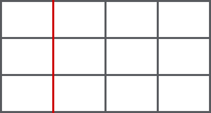
Grid Lines are the lines that make up the grid. These can be horizontal or vertical. We can refer to them by number, or by name (red = column line 2).

A Grid Track is the space between two Grid Lines, either horizontal or vertical.
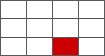
A Grid Cell is the space between 4 Grid Lines. So it is the smallest unit on our grid that is available for us to place an item into. Conceptually it is just like a table cell.

A Grid Area is any area on the Grid bound by four grid lines. It may contain a number of Grid Cells. Grid areas have to be rectangular – it isn’t possible to create an L-shaped area for example.
<div class="grid"><div class="box">A</div>… <!-- 6 items from A to F --><div class="box">F</div></div>
.grid { display: grid; grid-gap: 10px;grid-template-columns: 100px 100px 100px; }
The algorithm places the divs within the grid automatically.
<div class="grid"><div class="box">A</div>… <!-- 6 items from A to F --><div class="box">F</div></div>
.grid { display: grid; grid-gap: 10px;grid-template-columns: 1fr 1fr 1fr; }
<div class="grid"><div class="box">A</div>… <!-- 6 items from A to F --><div class="box">F</div></div>
.grid { display: grid; grid-gap: 10px;grid-template-columns: 1fr 2fr 1fr; }
<div class="grid"><div class="box">A</div>… <!-- 12 items from A to L --><div class="box">L</div></div>
.grid { display: grid; grid-gap: 10px;grid-template-columns: 50px repeat(4, 1fr) 50px; }
<div class="grid><div class="box">A</div>… <!-- 9 items from A to I --><div class="box">I</div></div>
grid { display: grid; grid-template-columns: 80px auto 100px;grid-template-rows: 60px auto 100px; grid-gap: 10px; }
.a {grid-column-start: 2;grid-column-end: 3;grid-row-start: 1;grid-row-end: 2;}
.a {grid-column: 2 / 3;grid-row: 1 / 2;}
<div class="grid"><header>Header</header><article>Article</article><aside>Aside</aside><footer>Footer</footer></div>
.grid { display: grid; grid-gap: 10px;grid-template-columns: 100px 300px 100px;grid-template-rows: 100px 100px 100px;grid-template-areas:"header header header""sidebar content content""footer footer footer"; }
header { grid-area: header; }article { grid-area: content; }aside { grid-area: sidebar; }footer { grid-area: footer; }
Puh, tough one. I don’t have enough experience with real projects.
Maybe for smaller projects with prefixes for older IE?
Flexbox is for one-dimensional layouts - anything that needs to be laid out in a straight line (or in a broken line, which would be a single straight line if they were joined back together). Grid is for two-dimensional layouts. It can be used as a low-powered flexbox substitute (we’re trying to make sure that a single-column/row grid acts very similar to a flexbox), but that’s not using its full power.
taken from Grid by Example
current version: W3C Working Draft, 29 March 2016
This spec is currently undergoing major changes!

.container {scroll-snap-points-x: repeat(100%);scroll-snap-type: mandatory;scroll-snap-type: proximity;}
scroll-snap-type: mandatory;
scroll-snap-type: proximity;
Scroll the containers! Example taken from MDN
That depends on the project. It’s similar to position: sticky. If you can live with the fact that your boxes will not snap in certain browsers then you should give it a try. Might be useful for one pagers or sliders.
current version: Last Call Working Draft, 10 October 2013
hanging-punctuation:none | [ first || [ force-end | allow-end ] || last ]
This feature is at risk and may be cut from the spec during its CR period if there is no (correct) implementation.

current version: W3C Working Draft, 16 September 2014
line-grid: match-parent | createline-snap: none | baseline | contain


No! And you won’t be able to for a long time.
Director’s cut (28. April 2017)
This is a commented version of the session I gave on frontend stuff.
All of the comment slides have a grey background like this one.
The tables from »Can I use« are embeds so they will always be up-to-date.
Cover image: Essentials, by Jesus Kiteque (unsplash.com, CC0)