Hi, Nicolai Schwarz here
textformer.de
Designer & Webdeveloper
Dortmund, Germany
doing Drupal since around 2008
mostly Site Building & Frontend stuff
written 100+ articles in the last 15 years for Screenguide, PC Magazin, Webstandards Magazin, t3n, PHP Magazin
Topics
- inert & dialog
- CSS Nesting
- CSS Layers
- CSS Scope
- Scroll-driven animation
- plus lots and lots of smaller stuff
Link, at the end
(Linklist + Slides)>
Can I use this?
Right now?
- In some cases: No! Not in production.
- In other cases: It depends
- Which browsers do you need to support? One year old? Two years old? Older?
- It is maybe just an added feature? As in: no content is lost.
- Maybe usable with @supports?
- Is there a polyfill?
- Or maybe a PostCSS plugin?
Baseline
Baseline gives you clear information about which web platform features are ready to use in your projects today. The core browser set: Chrome, Edge, Firefox & Safari.
Baseline has two stages:
- Newly available: The feature becomes supported by all of the core browsers, and is therefore interoperable.
- Widely available: 30 months has passed since the newly interoperable date. The feature can be used by most sites without worrying about support.
- Baseline 2023: items that became Newly Available in 2023.
- Baseline 2024: items that become Newly Available in 2024.
Limited availability across major browsers
(= don’t use it in production)
Newly available across major browser
Widely available across major browsers
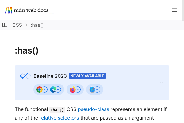
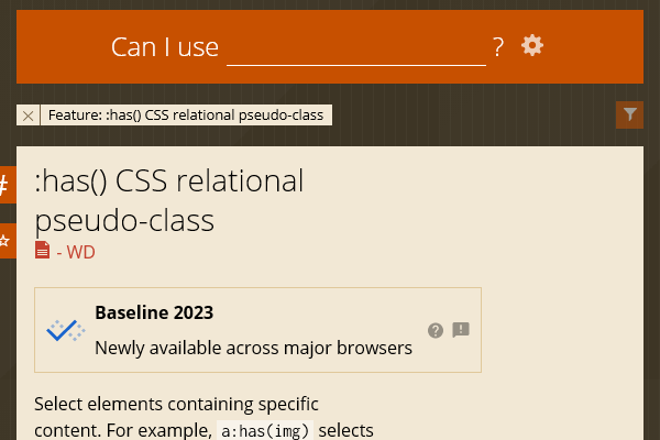
:has
Baseline 2023 Newly available
Sometimes called the parent selector. Selects elements containing specific content.
It’s actually more than a parent selector, because you can take siblings into account.
CSS, without has:
But, you need to check for the image in Twig or with a preprocess function.
CSS, with has:
Same class. No need to check in the theme.
Example: More than a parent selector
:has
Baseline 2023 Newly available
-
Chrome
since Aug 22 -
Edge
since Sep 22 -
Opera
since Sep 22 -
Firefox
since Dec 23 -
Safari
since Mar 22
See caniuse.com
Container Queries (size)
Baseline 2023 Newly available
A most wanted feature since the rise of Responsive Design.
Apply CSS to an element based on the size of that element.
Media Query
Container Query
HTML
Container Query
The @container style trigger is based on the size of the nearest ancestor with a containment context.
Container Query with name
Container Queries (size)
Baseline 2023 Newly available
-
Chrome
since Sep 22 -
Edge
since Oct 22 -
Opera
since Dec 22 -
Firefox
since Feb 23 -
Safari
since Sep 22
See caniuse.com
Polyfill (there are more)
Container Queries (style)
Limited availability
Check regular CSS declarations
(not yet supported)
When supported, this basic example will make the background color of any b and strong elements yellow when the parent is already bold. See mdn.
Example with registered property
Only elements that differ from the initial value, in this case, the main and its descendants that inherit that changed value, are a match. Again mdn.
Limited availability
-
Chrome
partial support -
Edge
partial support -
Opera
partial support -
Firefox
not supported -
Safari
not supported
See caniuse.com
inert
Baseline 2023 Newly available
A global HTML attribute to make an element inactive.
No clicking. No focus. No select. Also hidden from the accessibility tree.
A div with usual elements.
Same div with inert → no interaction
A simple slider with teaser elements
Same slider with inert
Be careful how you use it. Every user needs to know if an element can be interacted with or not. inert itself does not change the design.
For individual controls it is better to use the disabled attribute – and :disabled class.
inert
Baseline 2023 Newly available
-
Chrome
since May 22 -
Edge
since May 22 -
Opera
since Jun 22 -
Firefox
since Apr 23 -
Safari
since May 22
See caniuse.com
Bacon ipsum dolor amet turducken t-bone rump buffalo labore cupim ut meatloaf corned beef hamburger proident. Laborum boudin bacon, ullamco frankfurter chuck cillum doner sint dolore. Sirloin pork belly tenderloin enim et commodo sed lorem chuck.
sausage velit, voluptate in bresaola flank ground round. Ut veniam drumstick shank landjaeger. Spare ribs adipisicing consequat anim bacon aliqua labore pastrami brisket fatback beef exercitation duis aute. Aliqua aute landjaeger, pariatur velit t-bone sausage nisi fugiat enim magna sint.
<dialog>
Baseline 2022 Newly available
HTML element for a modal or non-modal dialog box or other interactive component.
Modals interrupt interaction (with the rest of the page being inert), while non-modals allow interaction with the rest of the page.
This element gives you some accessibility features for free.
Example from mdn: HTML
The dialog is hidden by default.
Example from mdn: CSS
A pseudo-element to style the background.
Example from mdn: JS
What do you get?
- <dialog> is hidden by default.
- Just a .showModal() and a .close() to show/hide the element with JavaScript.
- No need to set autofocus with JavaScript, just use the attribute.
- The layer element behind the dialog gets added auomatically. No extra element needed.
- All elements behind the layer are inert.
- Style the layer with ::backdrop.
- Use ESC to close the layer.
- A dialog can also be closed when a form inside the dialog is submitted.
The behaviour is a little bit different if you use the dialog as a non-modal element.
<dialog>
Baseline 2022 Newly available
-
Chrome
since Aug 14(!) -
Edge
since Jan 20 -
Opera
since Sep 14(!) -
Firefox
since Mar 22 -
Safari
since Mar 22
See caniuse.com
popover
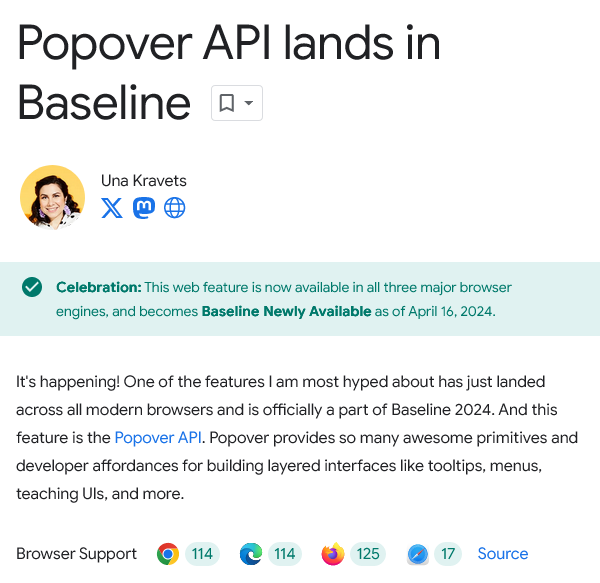
Baseline 2024 Newly available
The popover global attribute is used to designate an element as a popover element.
Similar to dialog, but there are differences.
Example from mdn, JS
Look ma, no JavaScript!
popover
Baseline 2024 Newly available
-
Chrome
since May 23 -
Edge
since Jun 23 -
Opera
since Jun 23 -
Firefox
since Apr 24 -
Safari
since Jun 23
See caniuse.com
dialog vs. popover
- <dialog> can be used right now. popover not yet.
- <dialog> needs JS. popover does not.
- Clicking on a popover background closes the popover. That is different from the <dialog> background.
- Best check with an accessibility expert how these new elements interact with screenreaders.
CSS Nesting
Baseline 2023 Newly available
Just like you know it from SASS or LESS.
For the most part.
CSS, without nesting selector &
CSS, with nesting selector &
equivalent to this CSS
So, why would you want to use the & in this example?
Because this is the old syntax, some browsers implemented first. It gains you around 6 months of older browser versions.
Nesting with combinators
Here the & nesting selector is optional.
Nesting with compound selectors
For compound selectors (multiple conditions on a single element) the & nesting selector must be used.
Appended nesting selector
Concatenation
CSS Nesting
Baseline 2023 Newly available
-
Chrome
since Dec 23 (partial before) -
Edge
since Dec 23 (partial before) -
Opera
since Dec 23 (partial before) -
Firefox
since Aug 23 -
Safari
since Dec 23 (partial before)
See caniuse.com
What about mixins?
A @mixin in SCSS
CSS Mixins & Functions Proposal
CSS Mixins & Functions
There is a proposal by Miriam Suzanne from Sep 13, 2023. This includes not just Mixins, but also Functions.
On Feb 12, 2024, the CSS Working Group has resolved to adopt this proposal, and begin drafting a new specification for CSS Mixins & Functions.
This actually became a W3C Editor’s Draft during my time in Burgas: CSS Functions and Mixins Module
CSS Cascade Concept
Find a value
- Relevance:
Find all the declaration blocks with a selector match for each element. - Importance:
Sort rules based on whether they are normal or important. - Origin:
Sort rules by author, user, or user-agent origin. - NEW Cascade layers:
Sort by cascade @layer. - Specificity:
ID (#example) > Class (.example) > Type (p) > No value (*). - NEW Scoping proximity:
Sort by @scope. - Order of appearance:
Last declared selector wins.
Origin and Cascade
lowest precedence
- normal user-agent styles
- normal user styles
- normal author styles
- styles being animated
- !important author styles
- !important user styles
- !important user-agent styles
- styles being transitioned
highest precedence
See e.g. mdn
Specificity: example l
Crimson wins. Last declaration.
Specificity: example 2
font-size will be 3rem. p.teaser has the highest specificity.
Specificity: example 3
Red wins.
:where and :is
supported by all browsers since 2021
Specificity: example 3 (again)
Approach: Use only classes
Approach: BEM
Approach: Tailwind
More realistic example
1. Change #main code
2. Use !important
3. Use higher specificity
4. Work with @layer
CSS Layers
Baseline 2022 Newly available
A way to organize CSS to avoid specificity problems.
Simple layers
Better order your layers
Anonymous layers & unlayered declarations
A p.teaser will still be black.
Let’s get dangerous
Example taken from mdn
Nested layers are possible
Layers can be imported
CSS Layers
Baseline 2022 Newly available
-
Chrome
since Mar 22 -
Edge
since Mar 22 -
Opera
since Mar 22 -
Firefox
since Feb 22 -
Safari
since Mar 22
See caniuse.com
My take
CSS Layers can help organizing your Styles much better – if you have a plan how to use your layers and if you stick to that plan.
On the other hand: This introduces a whole new level for people to get lost in specificity problems.
Sooner or later some Best Practices will emerge.
Keep it simple
CSS @scope
Limited availability
Limit the reach of your selectors.
Also comes with a donut flavor.
Easy example
Another way
But, we already know how to do that
Yes, in most cases very much the same effect. But there is still a difference: A .card img has specificity of 0-1-1. The img inside the @scope only has 0-0-1.
New selector :scope
Possible Variations
Specificity
Not the same
The Donut rises
The Donut rises
The Donut rises
The Donut rises
Of course this can be nested
Website Documentation
.manual
Text
Component from Website
as image
Text
Website Documentation
.manual
Text
Component from Website
@scope (.component)
Text
Will not work as the .component still inherits CSS from the rest of the page.
Website Documentation
.manual
@scope (.manual) to (.component)
Text
Component from Website
@scope (.component)
Text
Will work. But you can do the same with a system of classes.
Better example: Color themed components
Some text within .theme-light
Some text within .theme-dark
Without scope
Nested Color themed components
Some text within .theme-light
Some text within .theme-dark
Some text within .theme-light
Dark theme only works because of the order in CSS.
With scope
Result with scope
Some text within .theme-light
Some text within .theme-dark
Some text within .theme-light
This works, because scoping proximity overrules source order.
Note: Scoping proximity overrules source order but is itself overridden by other, higher-priority criteria such as importance, layers, and specificity.
See mdn.
Scope with varied specificity
Not good. Here .theme-light p has a higher specificity.
Result with bad scoping
Some text within .theme-light
Some text within .theme-dark
Some text within .theme-light
This works, because scoping proximity overrules source order.
CSS @scope
Limited availability
-
Chrome
since Oct 23 -
Edge
since Oct 23 -
Opera
since Dec 23 -
Firefox
not supported -
Safari
since Mar 24
See caniuse.com
CSS Cascade Concept
Find a value
- Relevance:
Find all the declaration blocks with a selector match for each element. - Importance:
Sort rules based on whether they are normal or important. - Origin:
Sort rules by author, user, or user-agent origin. - NEW Cascade layers:
Sort by cascade @layer. - Specificity:
ID (#example) > Class (.example) > Type (p) > No value (*). - NEW Scoping proximity:
Sort by @scope. - Order of appearance:
Last declared selector wins.
See e.g. mdn
CSS Logical Properties
Widely available
Logical properties and values provide control of layout through logical, rather than physical, direction and dimension mappings.
Useful for multilingual sites.
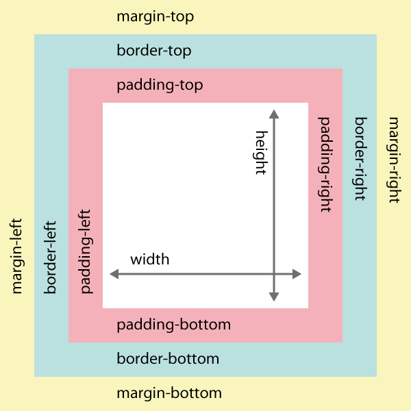
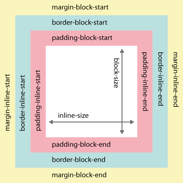
Old properties
writing-mode relative new properties
– here corresponding to western languages
The position depends on the language.
- left to right: English and most other languages
- right to left: like Hebrew or Arabic
- top to down, then right to left: Chinese, Japanese, Korean
Auf Be’eris Mauern schrieb ich ihre Geschichte
Aus den von Kälte zerrissenen Ursprüngen und Tiefen
Nun lest das Geschehene im Schmerz und in ihrem Lichte
Fallt in den Nebel und in die Dunkelheit der Nacht und in den Urschrei
…
עַל קִירוֹת בְּאֵרִי כָּתַבְתִּי קוֹרוֹתֶיהָ
מִמְּקוֹרוֹת וּמַעֲמַקִּים קְרוּעֵי קֹר
עֵת קָרְאוּ אֶת הַקּוֹרֶה בַּכְּאֵב וְאוֹרוֹתֶיהָ
נָפְלוּ לַעֲרָפֶל וַאֲפִלַּת לַיְלָה וִילָלָה כְּמָקוֹר
…
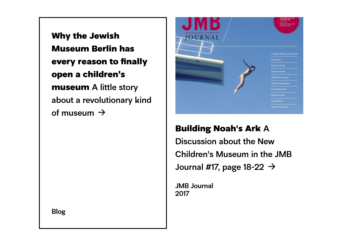
Taken from the Jewish Museum Berlin
HTML
Current solution (actually from 2020)
Alternative without reset
But here you need to know all possible languages.
Better solution
CSS Logical Properties
Widely available
(worked before Baseline came along)
-
Chrome
since Mar 21 (partial before) -
Edge
since Mar 21 (partial before) -
Opera
since Apr 21 (partial before) -
Firefox
since Mar 19 (partial before) -
Safari
since Sep 21 (partial before)
See caniuse.com
It might be a good idea to adopt this syntax in every project as there are more features that are using block and inline values.
For western languages you only need to know: block works vertically, inline works horizontally.
Scroll- driven Animations
Limited availability
Animate stuff based on the scroll position of a scroll container.
Note: Scroll-driven, not scroll-triggered!
time-based animation
Scroll Progress Timelines with scroll()
Scroll Progress Timelines
Lorem Ipsum is simply dummy text of the printing and typesetting industry. Lorem Ipsum has been the industry's standard dummy text ever since the 1500s, when an unknown printer took a galley of type and scrambled it to make a type specimen book. It has survived not only five centuries, but also the leap into electronic typesetting, remaining essentially unchanged. It was popularised in the 1960s with the release of Letraset sheets containing Lorem Ipsum passages, and more recently with desktop publishing software like Aldus PageMaker including versions of Lorem Ipsum.
It is a long established fact that a reader will be distracted by the readable content of a page when looking at its layout. The point of using Lorem Ipsum is that it has a more-or-less normal distribution of letters, as opposed to using 'Content here, content here', making it look like readable English. Many desktop publishing packages and web page editors now use Lorem Ipsum as their default model text, and a search for 'lorem ipsum' will uncover many web sites still in their infancy. Various versions have evolved over the years, sometimes by accident, sometimes on purpose (injected humour and the like).
Here the heart is tied to the scrollbar. That’s not useful.
Lorem Ipsum is simply dummy text of the printing and typesetting industry. Lorem Ipsum has been the industry's standard dummy text ever since the 1500s, when an unknown printer took a galley of type and scrambled it to make a type specimen book. It has survived not only five centuries, but also the leap into electronic typesetting, remaining essentially unchanged. It was popularised in the 1960s with the release of Letraset sheets containing Lorem Ipsum passages, and more recently with desktop publishing software like Aldus PageMaker including versions of Lorem Ipsum.
It is a long established fact that a reader will be distracted by the readable content of a page when looking at its layout. The point of using Lorem Ipsum is that it has a more-or-less normal distribution of letters, as opposed to using 'Content here, content here', making it look like readable English. Many desktop publishing packages and web page editors now use Lorem Ipsum as their default model text, and a search for 'lorem ipsum' will uncover many web sites still in their infancy. Various versions have evolved over the years, sometimes by accident, sometimes on purpose (injected humour and the like).
View Progress Timelines
Lorem Ipsum is simply dummy text of the printing and typesetting industry. Lorem Ipsum has been the industry's standard dummy text ever since the 1500s, when an unknown printer took a galley of type and scrambled it to make a type specimen book. It has survived not only five centuries, but also the leap into electronic typesetting, remaining essentially unchanged. It was popularised in the 1960s with the release of Letraset sheets containing Lorem Ipsum passages, and more recently with desktop publishing software like Aldus PageMaker including versions of Lorem Ipsum.
It is a long established fact that a reader will be distracted by the readable content of a page when looking at its layout. The point of using Lorem Ipsum is that it has a more-or-less normal distribution of letters, as opposed to using 'Content here, content here', making it look like readable English. Many desktop publishing packages and web page editors now use Lorem Ipsum as their default model text, and a search for 'lorem ipsum' will uncover many web sites still in their infancy. Various versions have evolved over the years, sometimes by accident, sometimes on purpose (injected humour and the like).
Now the heart is tied to its own visibility inside the scroller, based on entering and leaving the current viewport. In Firefox the heart is visible, but static.
Lorem Ipsum is simply dummy text of the printing and typesetting industry. Lorem Ipsum has been the industry's standard dummy text ever since the 1500s, when an unknown printer took a galley of type and scrambled it to make a type specimen book. It has survived not only five centuries, but also the leap into electronic typesetting, remaining essentially unchanged. It was popularised in the 1960s with the release of Letraset sheets containing Lorem Ipsum passages, and more recently with desktop publishing software like Aldus PageMaker including versions of Lorem Ipsum.
It is a long established fact that a reader will be distracted by the readable content of a page when looking at its layout. The point of using Lorem Ipsum is that it has a more-or-less normal distribution of letters, as opposed to using 'Content here, content here', making it look like readable English. Many desktop publishing packages and web page editors now use Lorem Ipsum as their default model text, and a search for 'lorem ipsum' will uncover many web sites still in their infancy. Various versions have evolved over the years, sometimes by accident, sometimes on purpose (injected humour and the like).
Scroll- driven Animations
See some better examples here:
scroll-driven-animations.style
Limited availability
-
Chrome
since Jul 23 -
Edge
since Jul 23 -
Opera
since Jul 23 -
Firefox
not supported -
Safari
not supported
See caniuse.com
CSS Feature detection
& user preferences
transition-behavior
@starting-style
aka
Transitions with
display: none
Limited availability
transition-behavior
@starting-style
aka
Transitions with
display: none
Limited availability
caniuse.com is a bit confusing right now, as there are many interacting items with different support.
:user-valid :user-invalid
Baseline 2023 Newly available
Better versions for :valid and :invalid.
:user-valid :user-invalid
Baseline 2023 Newly available
-
Chrome
since Oct 23 -
Edge
since Nov 23 -
Opera
since Nov 23 -
Firefox
since Apr 21 (partial before) -
Safari
since May 23
See caniuse.com
@supports selector() is supported by all browsers since Apr 2021.
new @media queries
Check for JavaScript
Baseline 2023 Newly available (caniuse)
Checks user preferences on device
Limited availability (caniuse)
Less data
Limited availability (can be enabled in Chromium, since 2020, caniuse)
Masonry Grid Layout
I had planned to show the plans for Masonry layout (extension to Grid Layout). But don't bother. This is a few years old, but it is going nowhere. See mdn.
(I am just mentioning this, because it was in the teaser text.)
Update 03.07.24: I’ve been wrong about the state of Masonry. Watch this talk from Rachel Andrew: Layout and Reading Order | CSS Day 2024
textformer.de/ddd24